CASE · VUEL
Less tradition. More momentum.
A corporate rebrand from Seeberger to Vuel. Visual Identity & Brand Design, concept project.
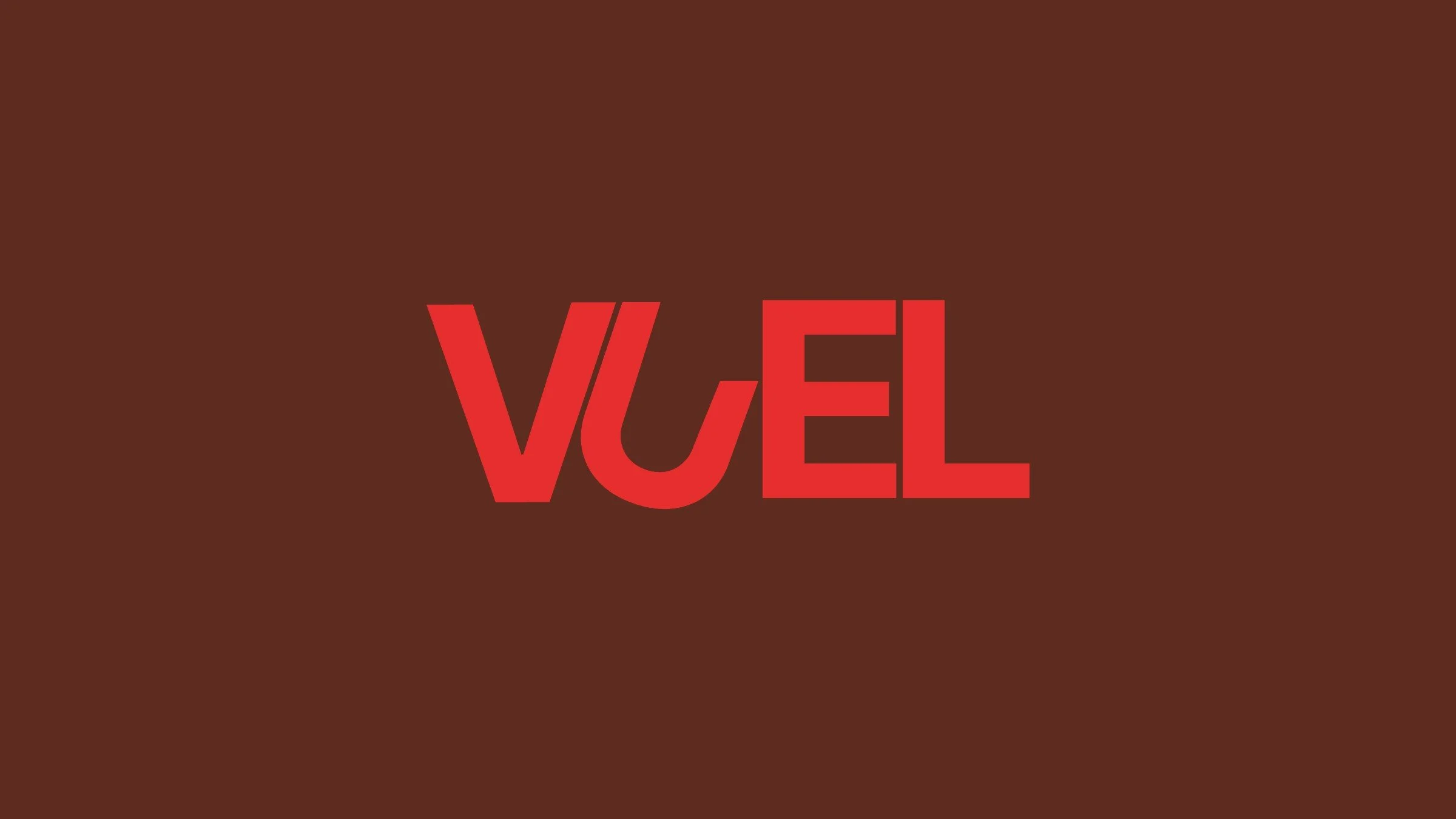
ProjectVuel, natural performance snacks
TypeConcept rebrand of Seeberger
ScopeVisual identity, packaging, out of home, social
My roleBrand strategy, visual identity, campaign design
The brief
Seeberger stands for nuts and dried fruit with a long heritage. The rebrand shifts it from tradition to a performance-first identity, built for modern, endurance-driven lifestyles.
The task: keep the trust in natural ingredients, but speak to people who train.
The idea
Nature doesn't do ordinary. Almonds, seeds and whole nuts give an athlete everything needed to go beyond the ordinary. So the identity stays bold, clean and unapologetically modern: no compromises, every snack is fuel.
Every snack is fuel for performance.
The identity
From Seeberger to Vuel in one move.
The wordmark. A compact, sporty logotype in red on deep brown, built to work from a pack to a billboard.
The campaign. Nuts at full scale, paired with short lines like "Nature performs. So should you."
What I did
Positioned the brand for performance and endurance
Developed the wordmark and colour system
Designed packaging, bottle and merchandise
Created out-of-home and social campaign layouts
The result
A heritage brand that now looks like it belongs at the start line.
Concept rebrand by Lena Gall, not commissioned by Seeberger